previous project:
ui/ux design | prototype
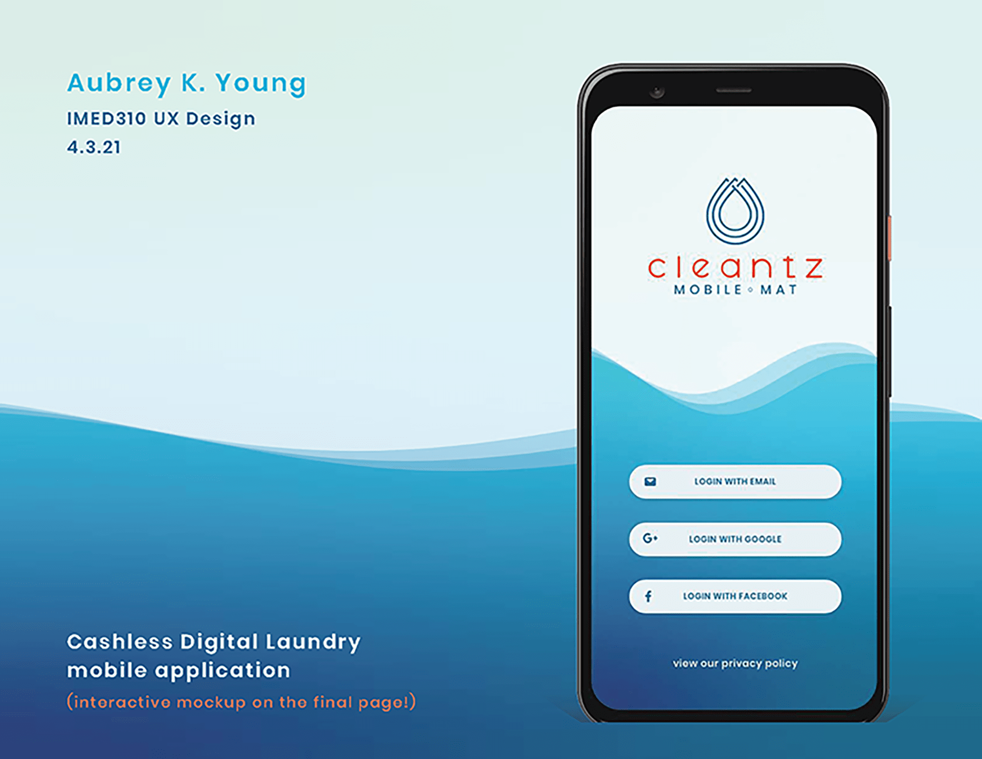
The challenge behind Cleantz Mobile-Mat is to design a mobile application with special consideration toward user interface & user experience (UI/UX).
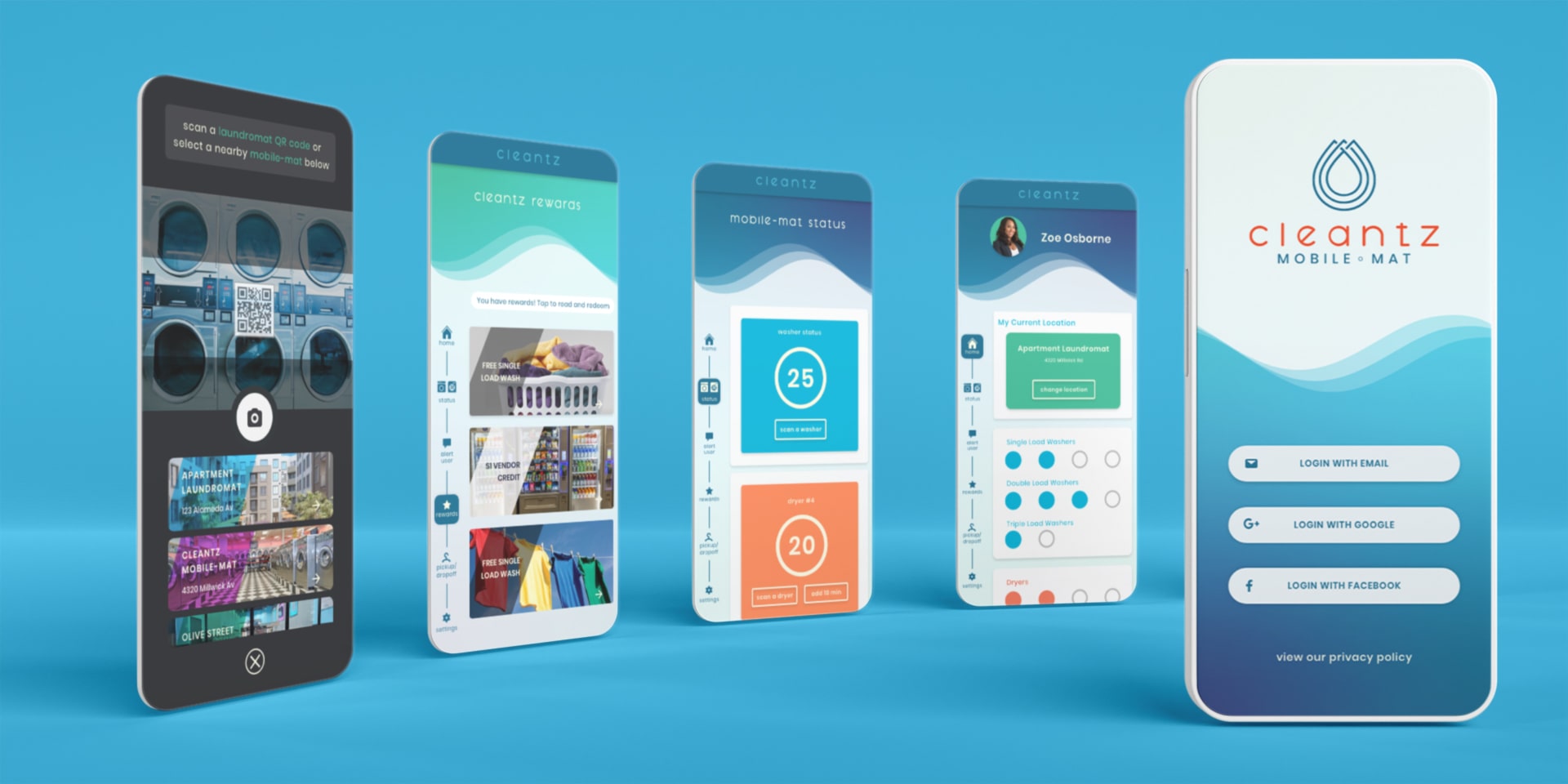
The system includes this laundromat app that ditches quarters for modern mobile transactions, and washers/dryers that operate with less contact. My goal is to create an attractive mobile app while also demonstrating intuitive design.
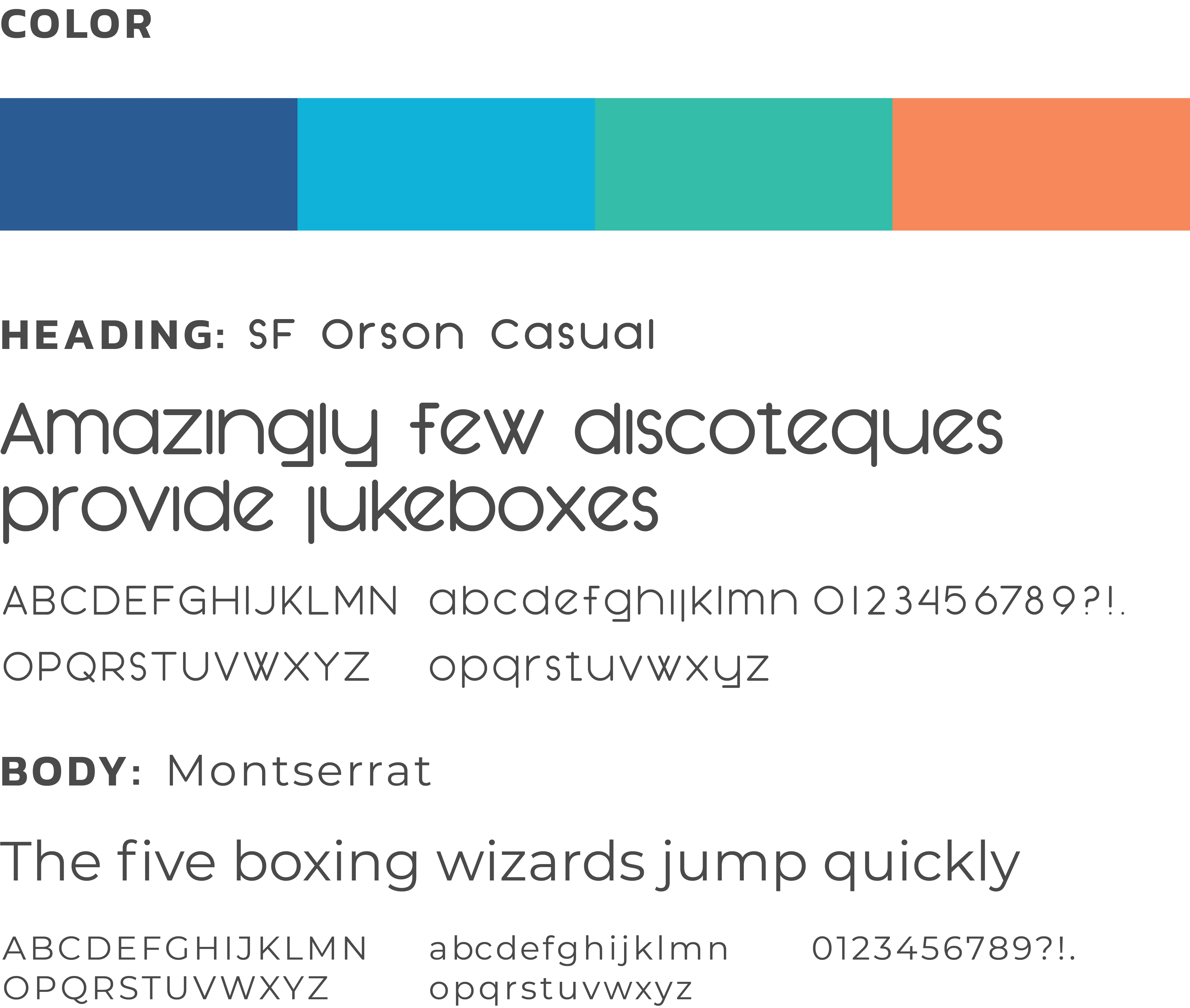
The triple raindrop shape in the logo indicates cleanliness with a tech feel. The logotype "cleantz" supports the tech feel of the app, while the color and font allow the words to stand on their own
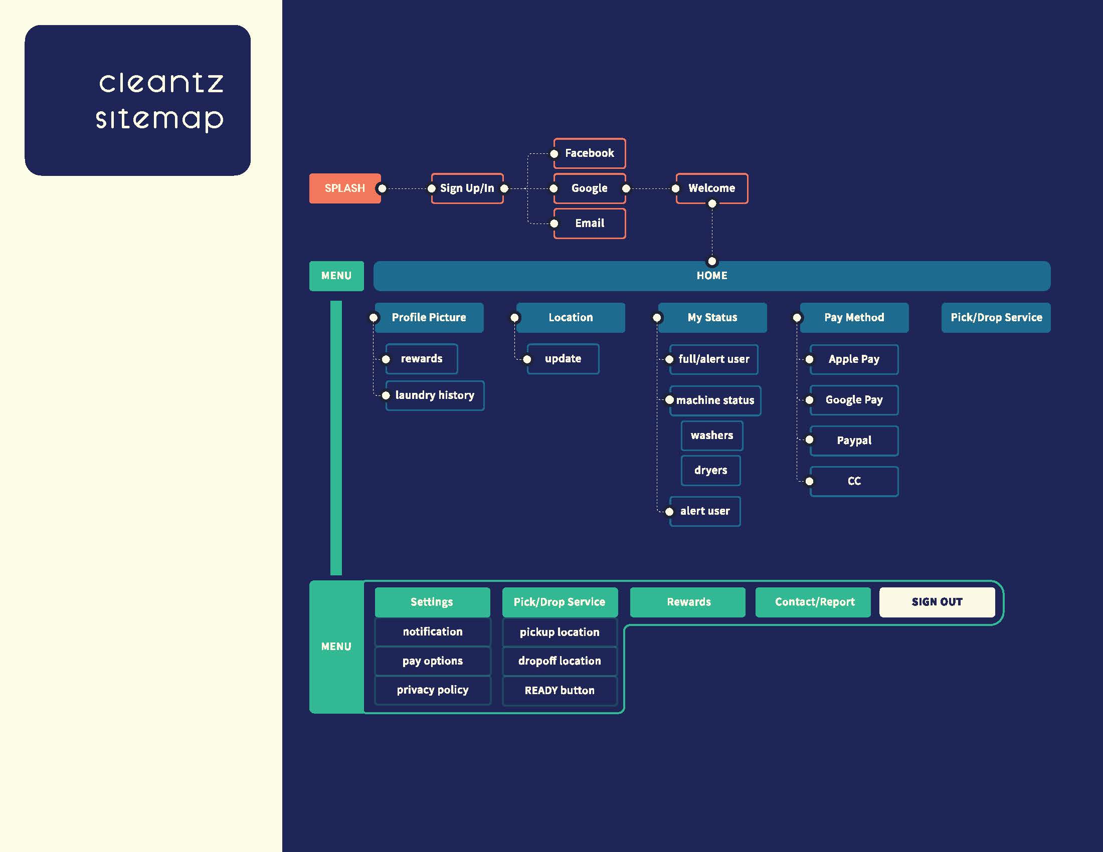
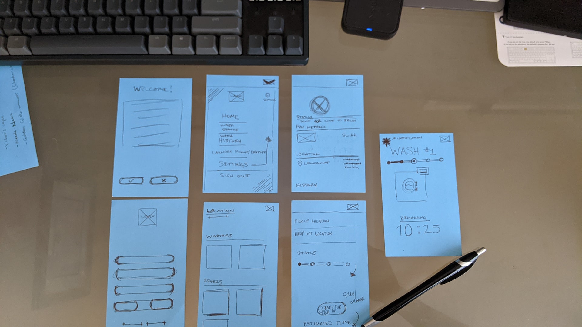
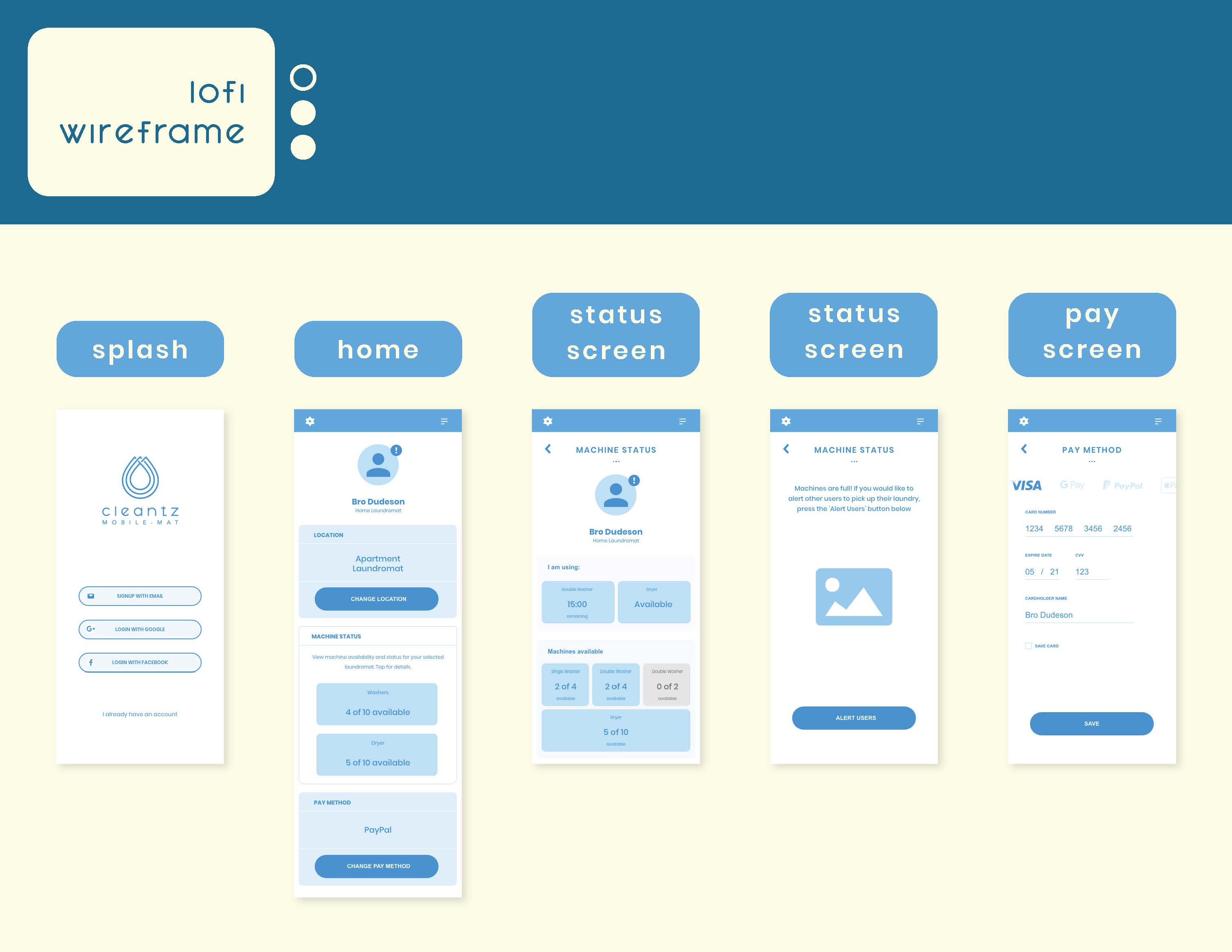
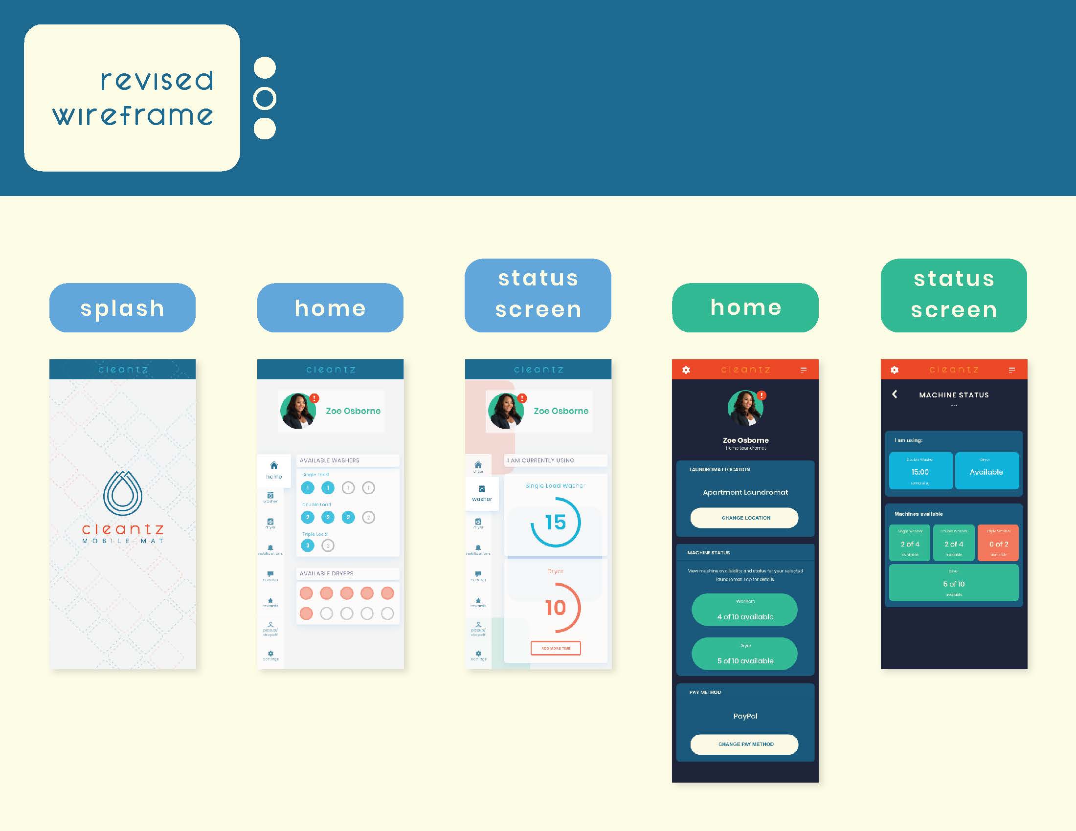
When I create wireframes, I progress from rough sketches in my notebook/notecards to rudimentary sketches on my computer. Through various rough drafts and feedback, I arrive at the final styling and layout of the mobile app's basic screens.
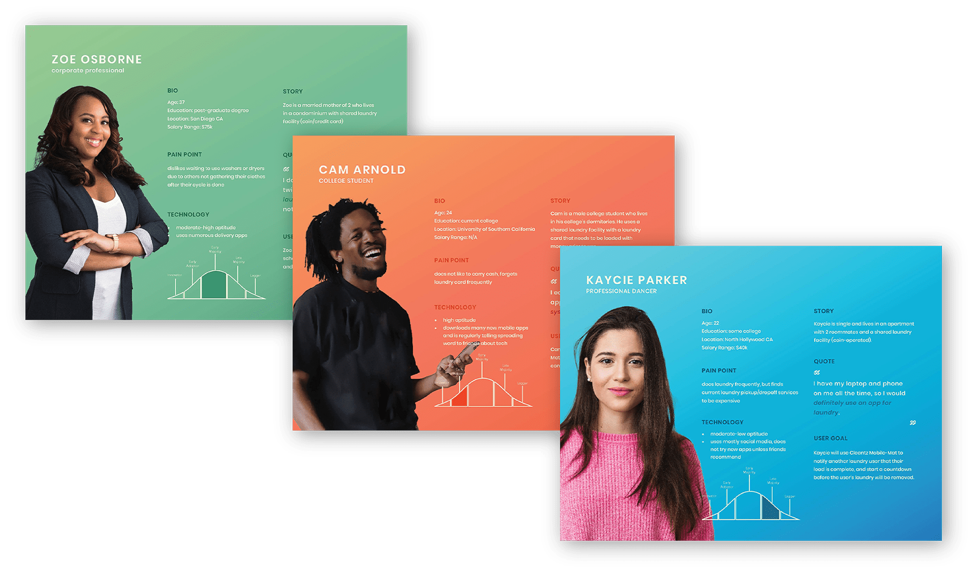
Personas are sample individuals who are most likely to use my app, based off of personal and online surveys. The names and pictures are made up, but the data within the slides is authentic. This step helps me visualize the pain points and goals potential users will solve using my app. Full-size readable versions of these personas are available in the Cleantz Design brief.
I chose a blue base and pastel colors to reflect the fresh and clean outlook on the 21st century laundromat
previous project:
next project: